Nescafé Design – Make Your World

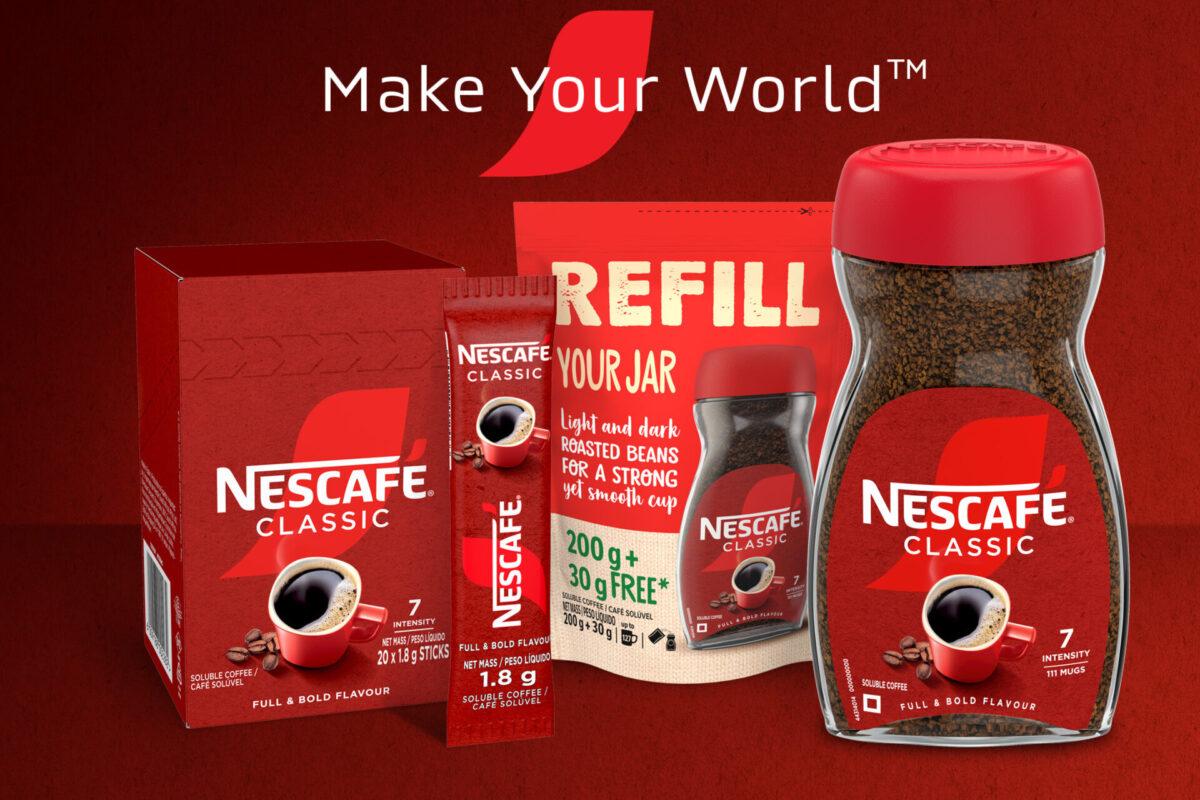
The essence of our task was to take Nescafé’s new Make Your World packaging designs and tailor them to fit the unique demands of the Southern African markets.
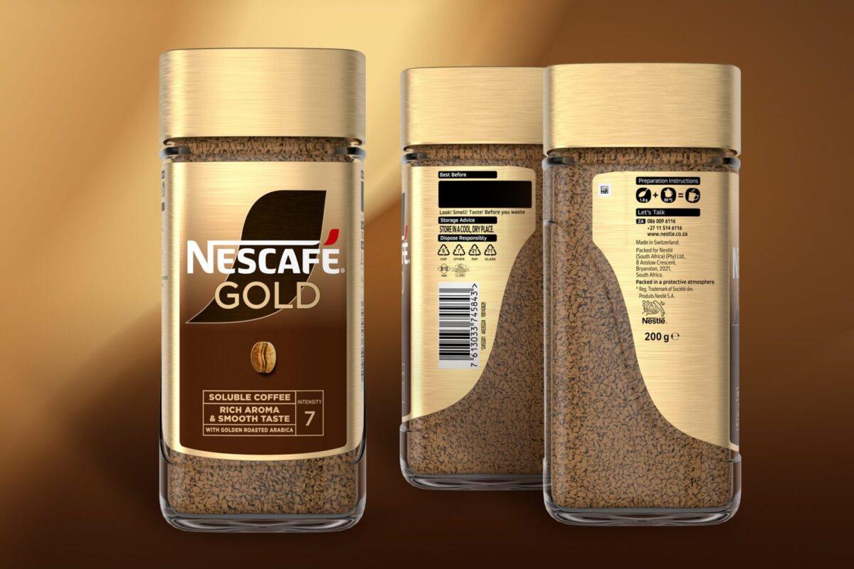
Global designs can sometimes overlook local regulations since there are various markets the products will launch in, and each country has their own rules & regulations. These are nearly impossible to plan for, since many can be contradictory. The printers are usually locally based too, and with each printer having different machines, settings and capabilities, the designs need to be adapted to ensure consistency with global intentions. This adaptation process doesn’t involve major aesthetic tweaks but encompasses a thorough alignment with local guidelines and technical & regulatory specifications.

One of the key elements we tackled was adjusting the placement and size of mandatory information. For instance, Mozambiquan regulations require the net weight to be prominently displayed on the front of the pack, with the text “net weight” and “peso líquido” included at specific font heights depending on the weight of the contents, or the square area of the packaging – a detail that might not be necessary in other markets. Similarly, the manufacturing and import addresses had to be updated to reflect local data accurately, and various religious certifications, recycling icons, and sustainability callouts needed to be incorporated.
Given Mozambique’s proximity and its Portuguese-speaking population, we ensured that all packaging destined for this market included precise Portuguese translations and relevant import addresses. This level of detail ensures that Nescafé’s packaging is not only compliant but also culturally and linguistically appropriate, enhancing its appeal and functionality in the local context.
Another aspect was to highlight Nescafé’s commitment to sustainability. The brand is transitioning towards using recyclable materials, and it was very important that this message was clearly communicated on the packaging. Most of the current substrates aren’t recyclable yet, but Nescafé’s efforts to switch to eco-friendly materials are prominently featured in the new design under the Designed for Future Recyclability efforts.

Our creative process is both detailed and continual, ensuring every detail aligns with Nescafé’s brand ethos and regulatory standards. We start with design and refinements, mapping the graphics on die-lines to fit various pack sizes. This is followed by finishing art and navigating a comprehensive approval process, including regulatory compliance and artwork checks throughout.
Once the designs pass these checks, we move to the physical production stage, which includes hard copy sherpa approvals and digital printer proofs. These steps ensure the accuracy of both artwork and information. Physical colour standards are then reviewed to guarantee that the printed colours match the design intentions, and barcode verification reports are conducted to ensure functionality.
One of the final steps in our process is the press pass (OPA), where we visit the printers to oversee the initial print run. This stage is very important as it allows us to make last-minute adjustments, ensuring that the print quality and colours are precisely what we envisioned. Sometimes, this process can be complex, especially when dealing with different components like cartons and laminates printed in different locations with varying lead times. Despite these challenges, we ensure that the colours and designs remain consistent across all packaging elements.
The result of this process is a range of Nescafé packaging that not only adheres to local regulations but also resonates with the brand’s global identity. Each pack showcases Berge Farrell’s attention to detail, ensuring that Nescafé continues to delight its customers with not just its coffee but its presentation as well.

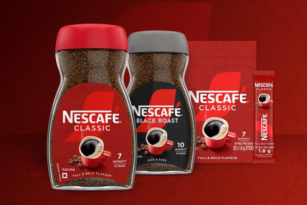
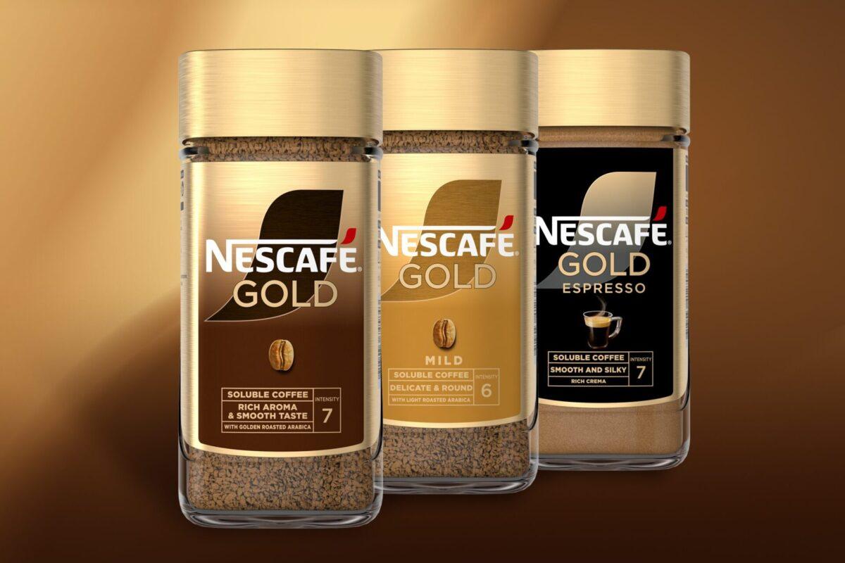
The collaboration between Nescafé and Berge Farrell has delivered dozens of packs, namely Nescafé Classic, Nescafé Gold and Nescafé Cappuccino – that blend global appeal with local relevance.
Through our detailed and creative approach, we have helped craft packaging that truly makes Nescafé’s world a more exciting and inviting place.