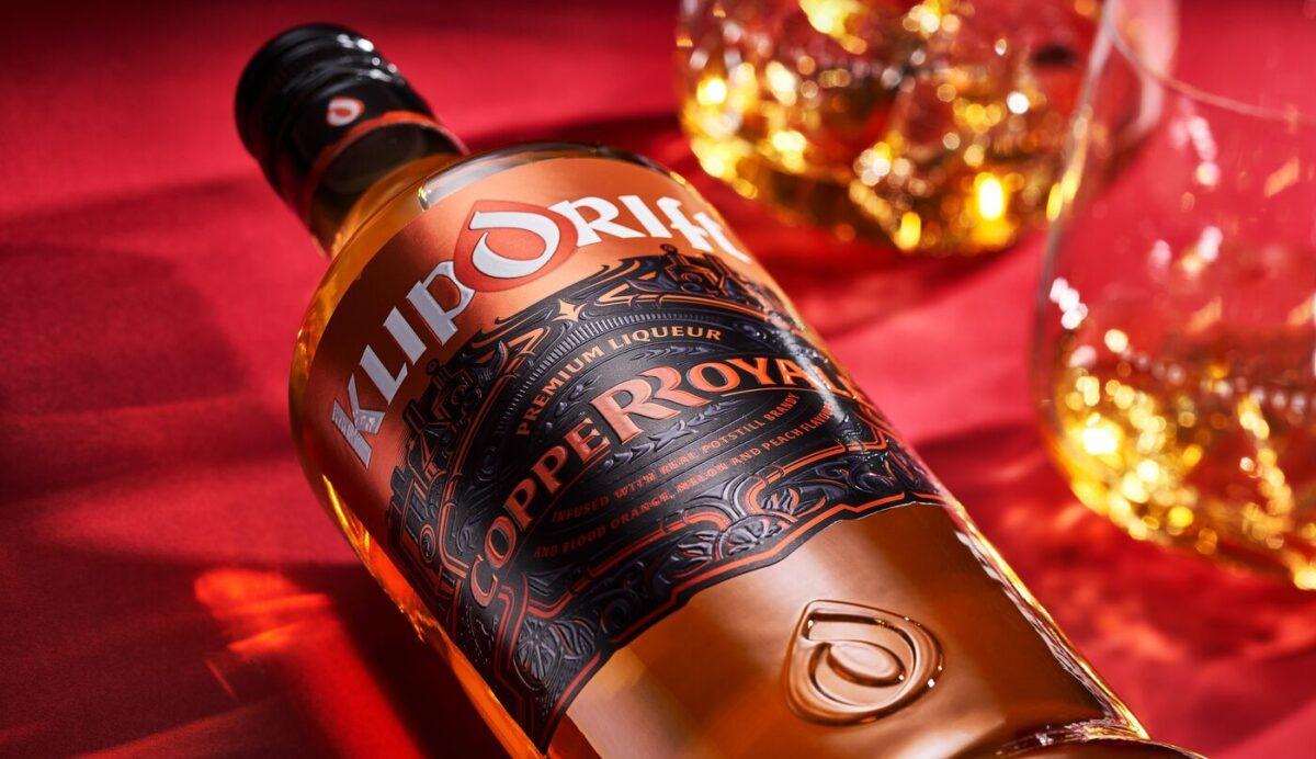
Introducing Klipdrift Copper Royale, a delightful low-alcohol spirit liqueur made with real potstill brandy and infused with vibrant flavours of blood orange, melon, and peach. Perfect for mixing or enjoying neat over ice, this new addition is crafted for those who love to connect and celebrate special moments with friends.
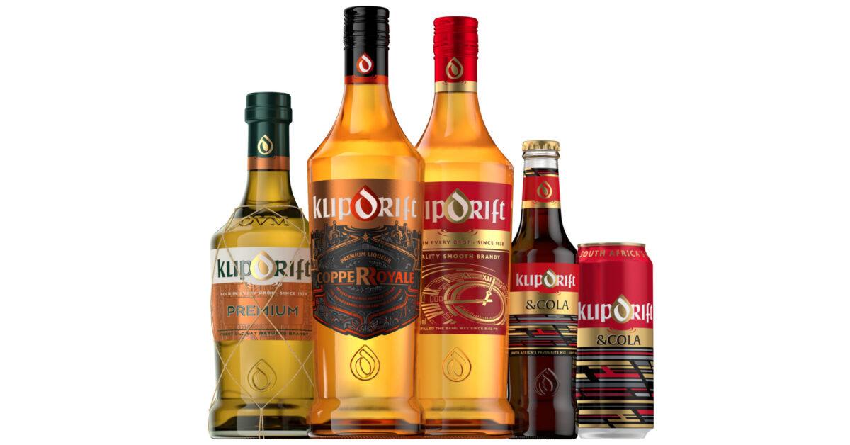
Klipdrift’s story began on 4 May 1938 at 8.02 pm, and since then, it has grown into South Africa’s favourite brandy. It’s a brand that stands for friendship and good times.
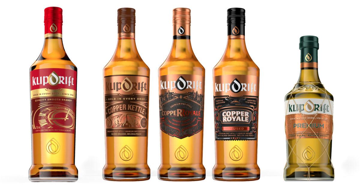
As the team behind Klipdrift’s new Copper Royale packaging design, we took inspiration from the iconic copper kettles integral to brandy production. Our goal was to capture the essence of its fruity flavours through a design that harmonises deep copper tones and intricate embossed textures, creating a stylish appeal. By seamlessly integrating visual allure with a tactile experience, our aim was not only to catch your eye but also to convey a sense of sophistication and elegance through touch. Below are some of the design options we presented initially:
The primary objective was to elevate the brand’s prestige and modernise its appearance to attract a broader and more diverse audience. Despite its masculine edge, the design, and its contents, aims to be inclusive, blending heritage with contemporary elements. The incorporation of the selected elements adds a vintage charm, while clean lines and modern typography maintain relevance and style. It exudes elegance yet remains approachable, inviting everyone to savour moments of refined pleasure and companionship. This thoughtful fusion positions Copper Royale as a standout addition to the Klipdrift family, being the first flavoured brandy produced by a major South African distillery, guarantees its timelessness while also captivating newcomers.
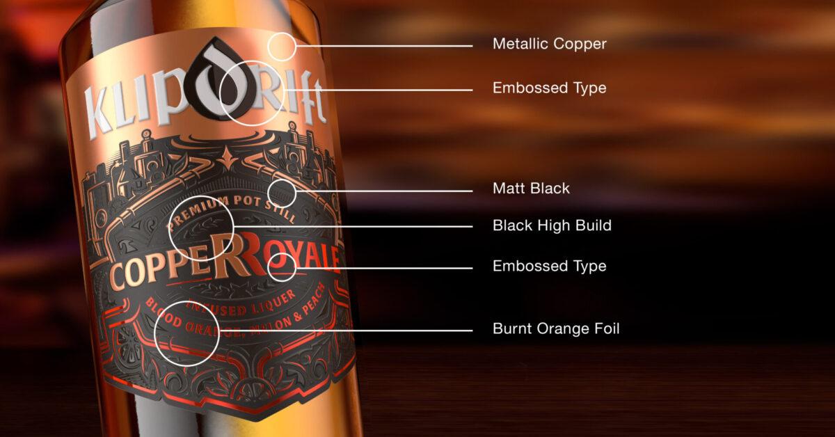
Maintaining a classic aesthetic, the Copper Royale label evokes a masculine, steampunk vibe with a refined craft finish. By using copper foil accents against a matte black backdrop, we were able to emphasise & complement the warm colours that imbue a youthful charm while preserving the Klipdrift legacy and giving Copper Royale its distinctive identity. This mirrors the exceptional quality of the brandy within while appealing to a younger, modern demographic. The label not only stands out on the shelf and narrates a tale of craftsmanship and innovation, encapsulating the essence of Klipdrift and paying homage to its legacy while confidently embracing the future.
Our design for Klipdrift Copper Royale seamlessly blends tradition with contemporary style. The label visually and tactually embodies the brand’s dedication to quality and innovation, inviting consumers not only to relish the brandy’s taste but also to immerse themselves in its rich narrative. As Klipdrift continues to evolve, the Copper Royale label stands as a testament to its enduring allure and modern sophistication, solidifying its position as a preferred choice for moments of refined pleasure and social connection.